ux/ui design
A reimagined mobile app for farmer's almanac
ROLE
UX Designer
type
Educational Project
YEAR
2024

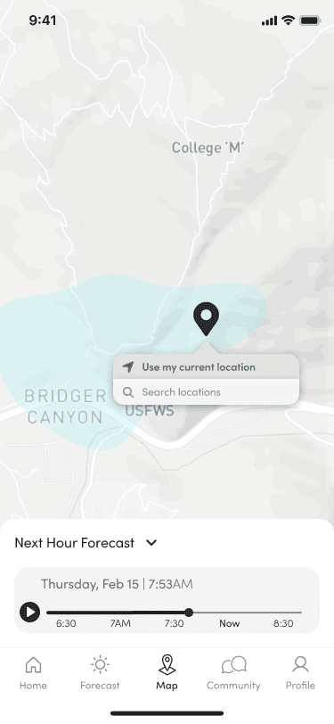
The team at Farmer’s Almanac would like an app that allows for personalized tracking by location of predicted weather patterns, a community forum for farmers and weather enthusiasts to share insights and experiences, and a comprehensive suite of tools and resources to empower users to make informed decisions and connect with their environment. Additionally, the team is open to exploring the creation of a unique new brand for the app, distinct from the current Farmer's Almanac branding.
This section outlines my step-by-step process of analyzing the Farmers' Almanac UI using content hierarchy, user-centric design, and consistency principles.
Design principle a
Content Hierarchy
Prioritize content based on importance and relevance to users. Ensure that essential information is easily accessible and not overshadowed by ads or other distractions.
Design principle b
User-Centric Design
Designing with the user in mind ensures that the product meets the needs and preferences of its target audience.
Design principle c
Consistency
Consistency in design elements such as typography, colors, and layout helps create a cohesive and professional-looking product.
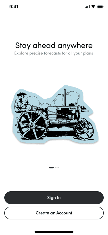
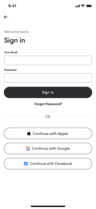
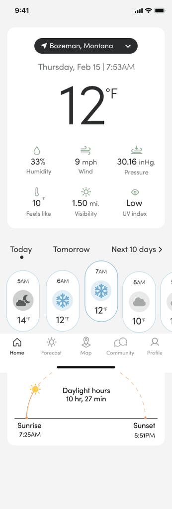
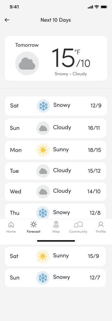
Terra Solis aims to deliver a seamless experience for farmers, integrating weather forecasts, planting guides, and market insights into one intuitive platform.
Comprehensive Weather Insights
Accurate and location-specific weather forecasts to aid in planning farming activities.
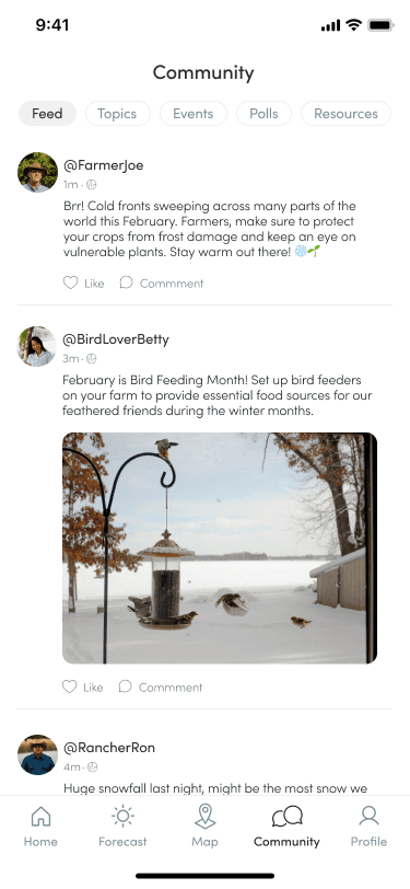
Community Engagement
A platform for farmers to share knowledge, experiences, and support each other, fostering a collaborative environment.
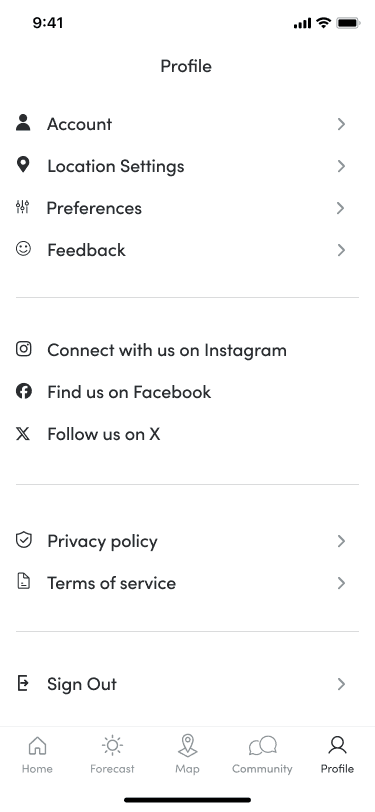
Intuitive User Experience
An intuitive and easy-to-navigate interface, ensuring accessibility for farmers of all tech proficiency levels.


